Captain’s Log
An accessibility checklist.
Do's and Dont’s to ensure an accessible experience.
Keyboard focus
Do make sure that every interactive item has a clear focus state so keyboard users can identify where they are on the page.
Descriptive button labels
Do make sure that all of your buttons and links have clear descriptive labels (ex: “Apply Changes” instead of “Click Here”).
Tab order
Do make sure that keyboard navigation order matches the visual order of the page.
Touch target size
Do make sure that every interactive item has a touch target size of at least 44px x 44px.
Alt text
Do make sure that all non-text content (pictures, charts, icons) have alternative text and accessible names.
Color contrast
Do make sure that all foreground colors pass 4.5:1 for text and 3:1 for graphics.
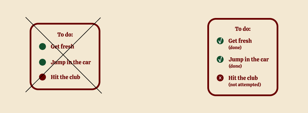
Color as information
Don’t rely on color alone to convey meaning (use icons, text, and/or patterns).
Headings
Do make sure that page titles and headings describe each section’s purpose clearly.


